These guidelines are key marketing and branding references for anyone involved in the promotion and communications of Brussels, from internal teams to third-party marketers, public relation groups, regional partners, etc.
More info on the rules for the use of the shared brand BRUSSELS.

1. Brand Tone & Messaging
For our audiences of visitors, businesses, talent and students, messages need to explain the many advantages of Brussels in a way that also highlights its perfect imperfection and the opportunity for those who come to the city to live who they truly are.
Brand Tone
How does an approachable city that’s less coded and more playful-rebellious speak to its audiences? In a highly spirited, very helpful and absolutely personal fashion.

A city of humans and a city for humans, Brussels speaks your language, as they say in English. In our communication, we’re transparent, informal and personal, and one on one. We speak Brussels: we acknowledge our juxtapositions and tensions. We dare to admit that we’ve shown up to a serious meeting with a bit of a hangover—and to acknowledge that we’re connoisseurs of waffles from food trucks and of Michelin-starred meals. We speak frankly and we dare to share that we are ourselves.

We’re a city that sees itself clearly and accepts itself, warts and all. So we don’t sugar coat. We seek to push buttons and elicit an emotional response, so we’re not afraid to be provocative. We don’t shy away from humour: we’re emphatic and lighthearted by nature, just as we’re also serious policymakers by profession. We speak boldly, daring our interlocutor to try Brussels, to be Brussels, to be themselves.

We want our talent, visitors and investors to get ahead—to get what they need to advance. We want to facilitate—to de-silo and simplify by being useful and informative. Wherever possible, we try to understand needs and to make introductions. We speak like a guide, a mentor and a friend.
Hero Messaging
A few messages transcend audiences. These four are useful in many circumstances.
Dare to be yourself. Dare to be Brussels.
Blend in, stand out.
Be a Brusseler, Be a Bruxellois, Be a Brusselaar.
Brussels dares you to get out of your head and into the moment. Brussels dares you to be yourself.

Leisure & Visitors
Visitors will experience Brussels from many perspectives. For them, an emphasis on exploring the freedom to be themselves is an exciting challenge. In exploring the Region, our visitors discover many facets of themselves.
Originators welcome.
Come as you are.
Brussels is an affordable city of rich discoveries and rewards
We're proudly imperfect believers in a better world, artful embracers of modern chaos, originators and explorers.
Brussels dares you to be a waterzooi-eater, an electronic music nerd, a cheerleader for the other side.
Brussels dares you to get out of your head and into the moment. Brussels dares you to be yourself.

Business and Talent Attraction
Businesses and potential residents need informative messaging. With the new brand, that messaging takes on new interest and differentiation.
We're the capital of European connections to places and people. And we're its capital of conviviality.
Brussels' diversity makes it fertile soil for experimenters, collaborators and originators.
You didn't come all this way to be someone else. You came to Brussels to be yourself.
Brussels' decision-makers understand how to lead and they know how to live.
Dare to bring your vision to Brussels.
Brussels is businesslike. And we're bons vivants.
We're proudly imperfect believers in a better world; we're progressive and principled policymakers, innovators and explorers.

2. Logo
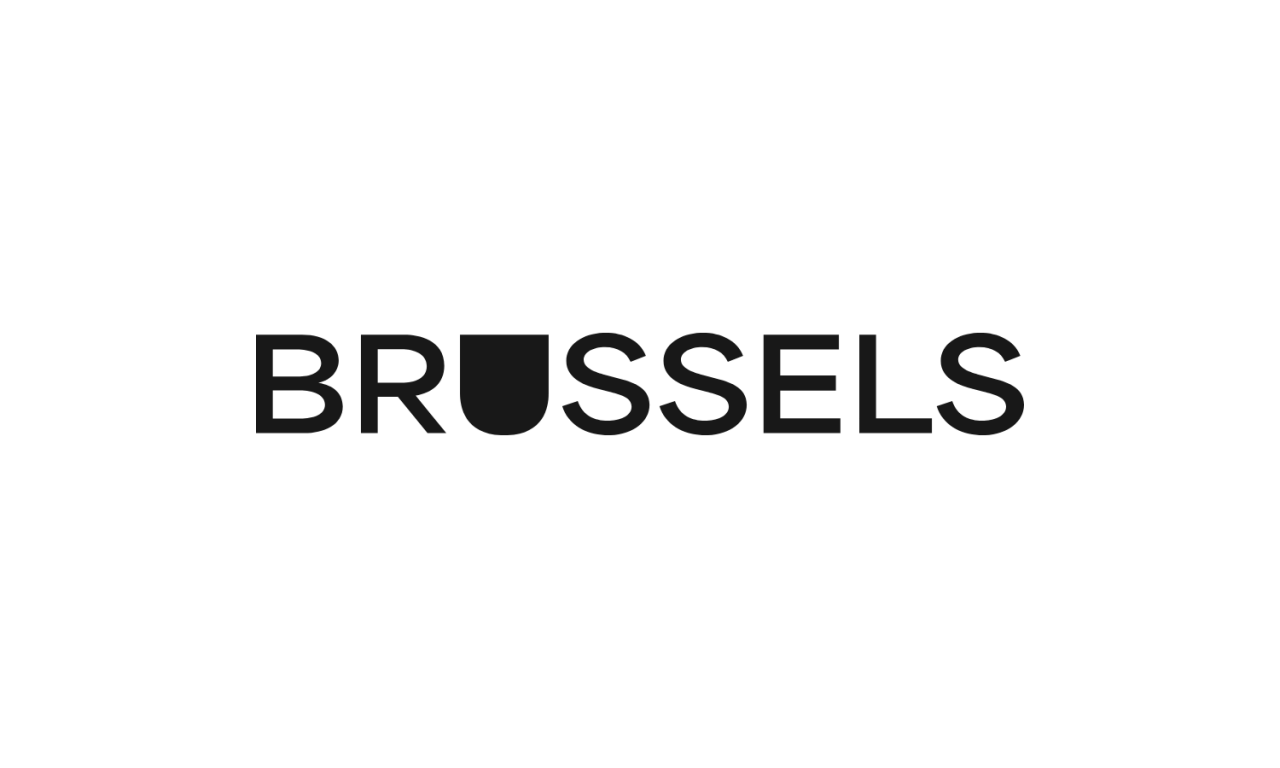
Our logo articulates ‘Dare To Be Yourself’ by providing a space within the letter U where anyone can add themselves and their voice.
Download Brussels Logos
Download
- Filename
- Brussels_Logos.zip
- Size
- 1 MB
- Format
- application/zip
Logo Colours
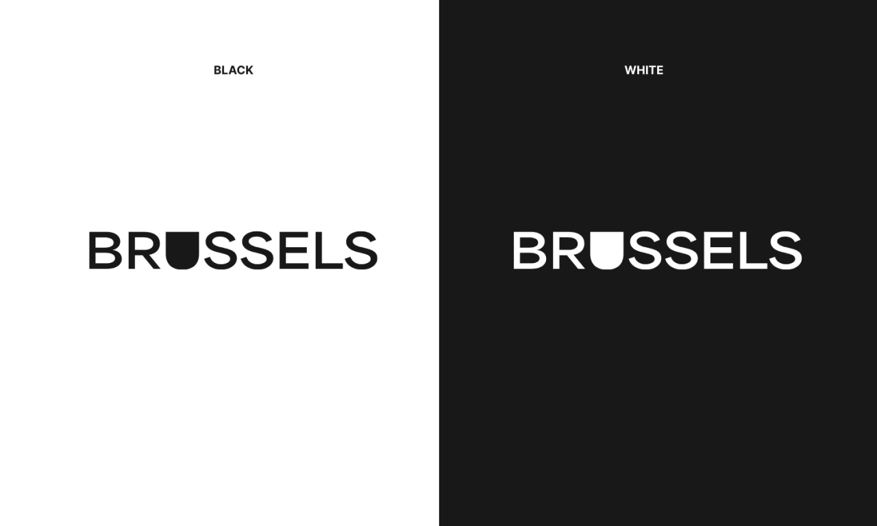
Our logo can be reproduced in our two brand colours: black and white. Black is our primary use with the white version for instances where we need higher contrast.
- Use RGB logo for digital media applications.
- Use CMYK logo for printing applications.
- Use Pantone logo for spot colour printing.
Minimum Size and Clearspace
The logo should never appear smaller than 9,5mm wide in printed form or 150 pixels wide in digital form. The minimum size is specified to ensure brand legibility. The logo has also been designed with a minimum clearspace to allow the brand to breathe. Leave the width of the ‘U’ letter around all sides of the logo, as shown.

Logo Versions
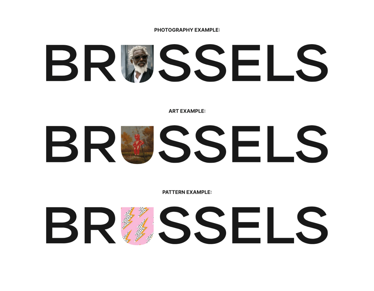
Two versions of the logo can be used—the primary version and the window version. The primary version is used in most cases; the window version is used where we need to grab attention, such as a billboards, adverting, and on social media. The following images outline how we use the window version.
A Window for Imagery
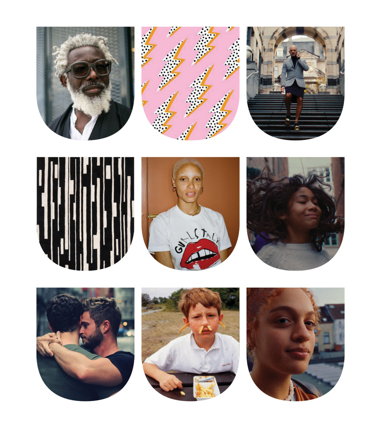
There are no strict rules around what fits into the U window, nor is there a one-image-fits-all solution. The ‘U’ can house photography, video, illustration, art and patterns. Please use design sense when using the window for marketing applications.
Logo Misuse
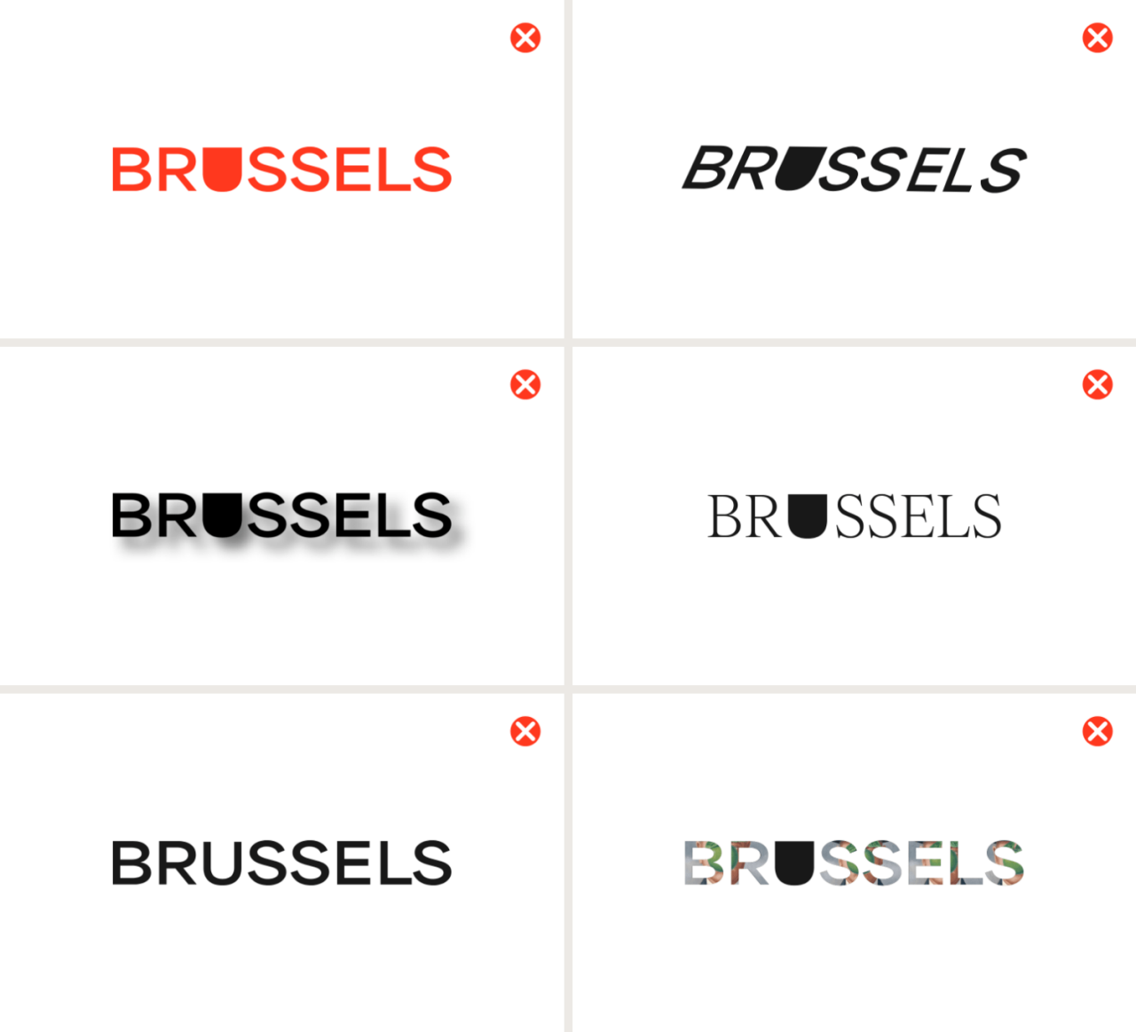
Every element of the logo has been expertly crafted and should not be modified. Below are some actions to avoid when working with the logo. Do not colour the logo. Do not distort, shear, skew or rotate. Do not add effects. Do not substitute the logo type with other fonts. Do not replace the 'U'. Don not use the other letterforms as windows.
3. Colour
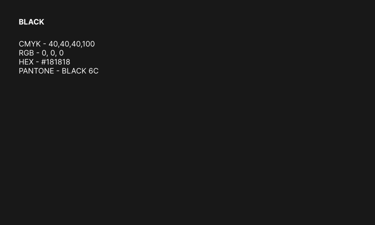
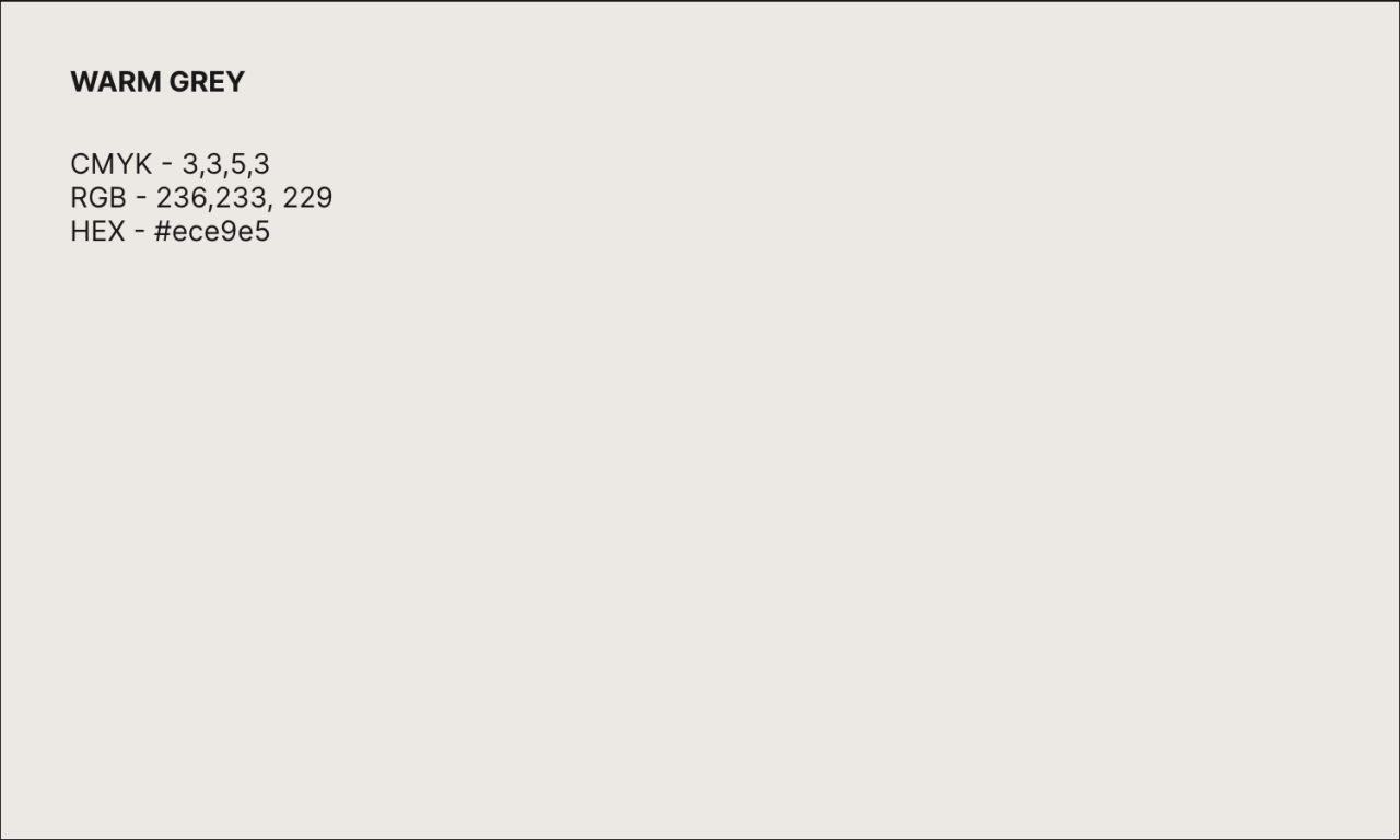
Our colour palette speaks volumes about our brand, laying a foundation and declaring our intentions. It is direct and daringly simple.
Colour Palette
Our colours are clean and simple and are a visual articulation of ‘Dare To Be Yourself’. There is no ambiguity with our brand; we are proud and direct with our use of colour.

Web Only
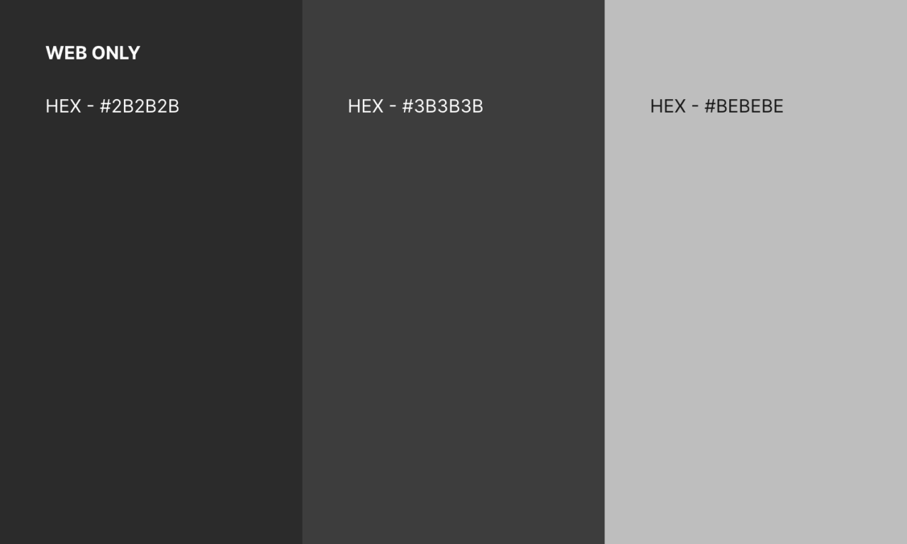
A set of additional greys have been added to the brand for use on web only to allow for more flexibility in contrast. Examples of this can be seen throughout this brand hub.
4. Type
The character of a typeface communicates as much as the words themselves. Both the sans and serif fonts take cues from editorial design and highlight the varied authentic voices of Brussels.
Download Brussels Serif and Inter Fonts
Headline Fonts
We use two editorial style typefaces, Brussels Serif and Inter Medium, as our headline fonts. These two fonts are used together to pay off the eclectic identity of the city.

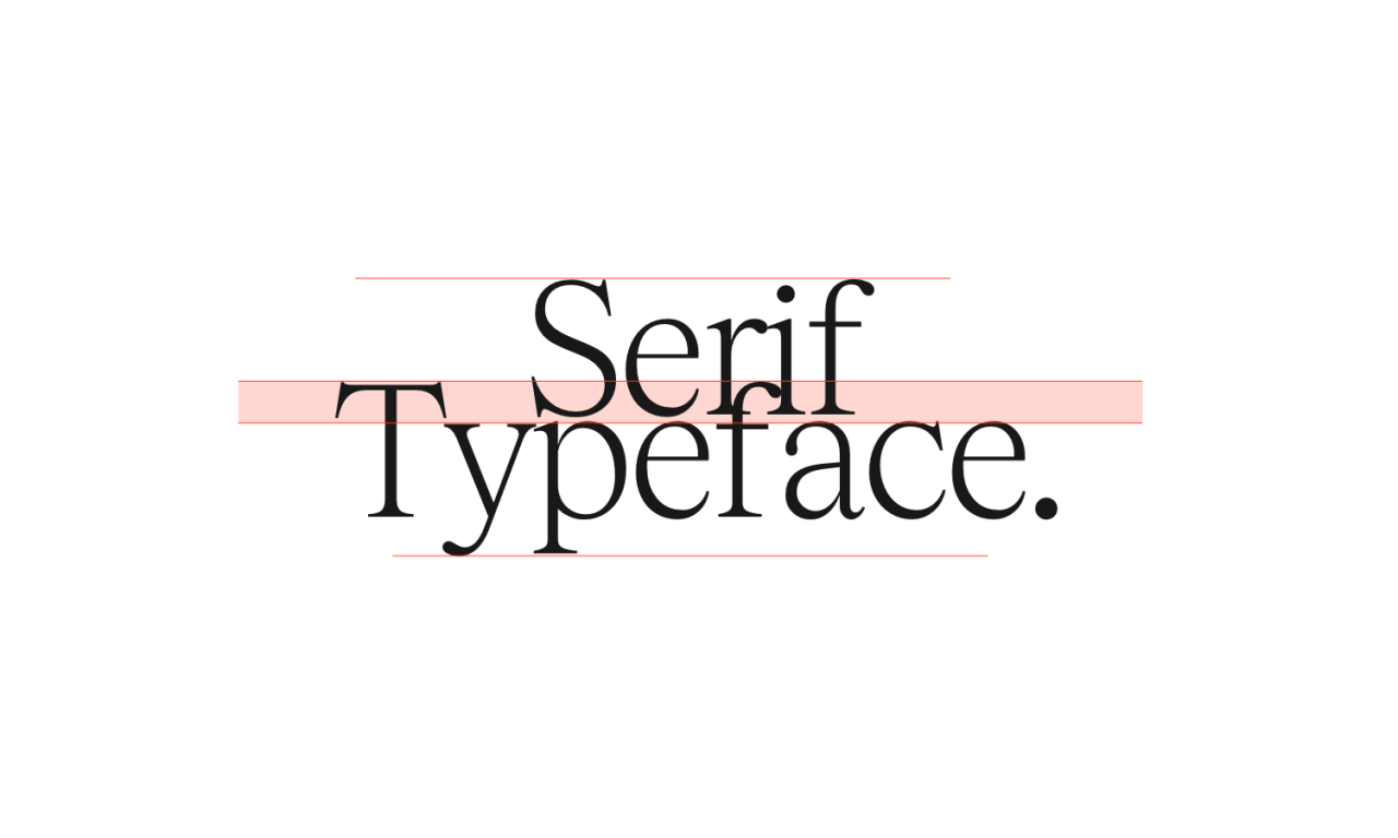
Typesetting Headlines Line Spacing
We use a tight line spacing when using Brussels Serif in headlines. This adds a moment of rather daring visual imperfection into our marketing materials. This should be optically adjusted so that the overlap is around 20-25% of the letterforms.
Letterspacing
Pay close attention when using Brussels Serif. The letterforms need manual typesetting with at least -25 letterspacing.

Share X Height
When using the two fonts together as headlines the type sizing of each should be optically sized so they have the same x-height even though the two fonts show different type sizes (as shown).

Body Copy Fonts
Inter is a clean, highly legible and competent typeface that is perfect for body copy. It balances well against our headline fonts. We’ve featured weights most commonly used throughout this document. However, we encourage you to use your design sense to solve specific type hierarchy problems.
*For any further guidelines, please refer to the Brand Guidelines pdf, downloadable at the top of this page.
5. Partner Lockups
Brussels partners with a number of organizations. When co-branding with Brussels, partner brands will follow these guidelines, regardless of brand dominance. These guidelines should be used in addition to all requirements for using the Brussels logo.
Horizontal Lockups
Whenever there is a partner, the Brussels logo always leads, and the partner branding follows in the lockups.
The second logo is base-aligned with the Brussels logo and optically scaled to match the size of the Brussels logo.
Negative space is used to separate the logos. We use the width of the U in Brussels as a size guide as shown.
A line is used to separate the logos.
Co-branded logos are always in black and white (no colour) to adhere to eco-design principles and to mirror our new look and feel.

Vertical Lockups
The Brussels logo is always on top and partner logos below in branding lockups.
The bottom logo is width-aligned with the Brussels logo.
Negative space is used to separate the logos. We use the width of the U in Brussels as a size guide as shown.
A line is also used to separate the logos.
Co-branded logos are always in black and white to adhere to eco-design principles and to mirror our new look and feel.

Example

6. Graphic Shape
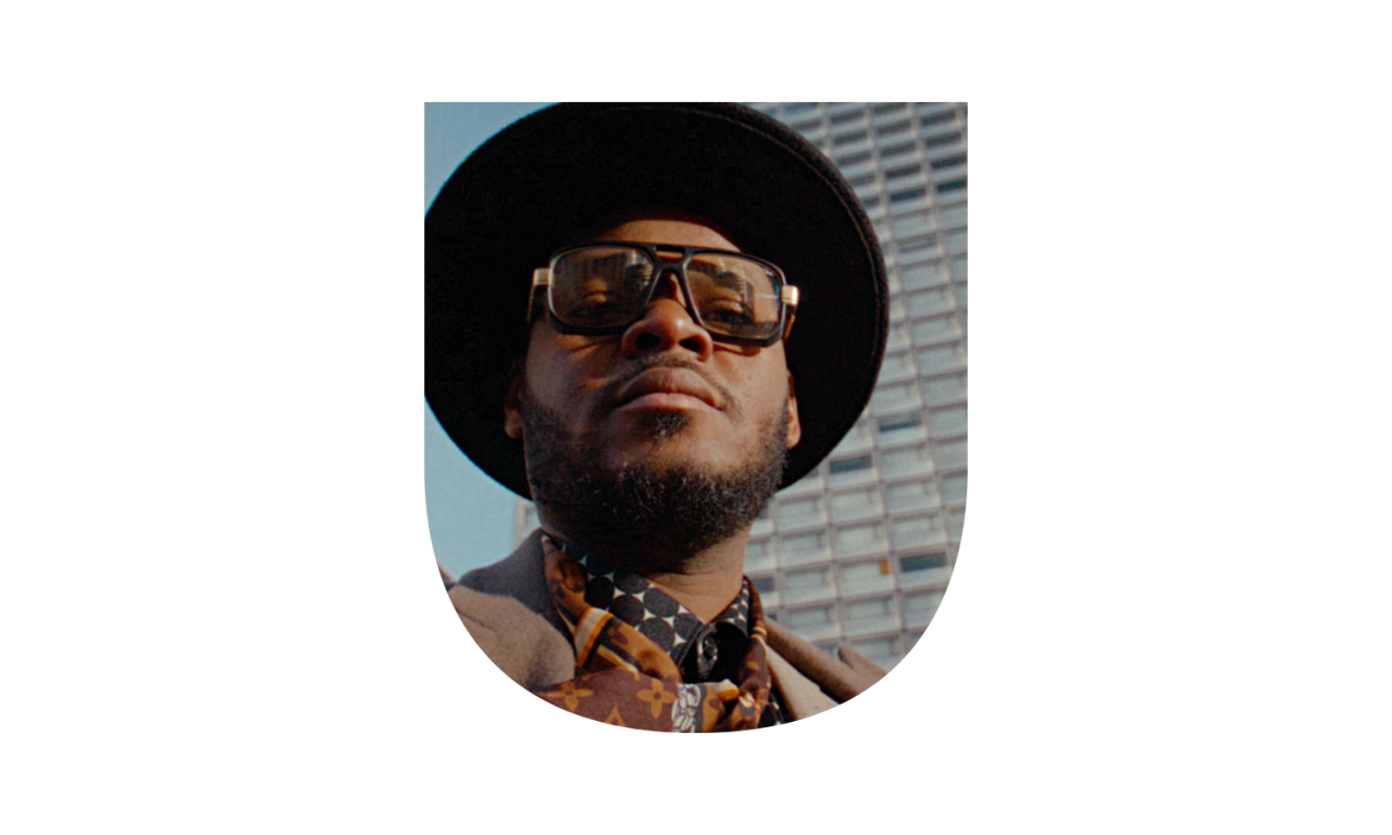
Our visual language uses a large graphic U shape that can house imagery and represent the ethos, people and experiences of Brussels.
Graphic Shape
The U in the logo can be used as a supergraphic device on marketing materials. Like in the logo, this is used as a window to house photography, video, illustration, art and patterns.
Supergraphic
The U from our logo can be used as a supergraphic on marketing materials such as signage. It should only be used as a supporting background element and should not house imagery. The U supergraphic can be rotated up to 35° in either direction: this is to ensure that it is still legible as a U shape. It can be cropped as needed to create a dynamic composition.

7. Grid Structure
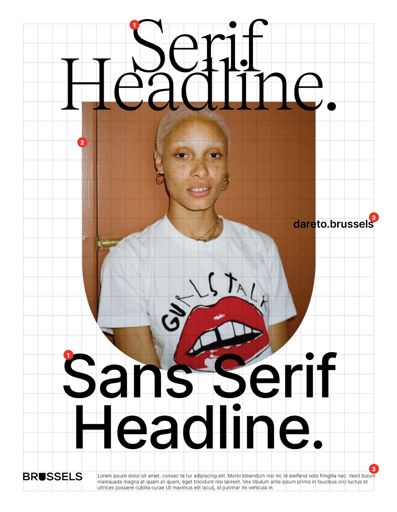
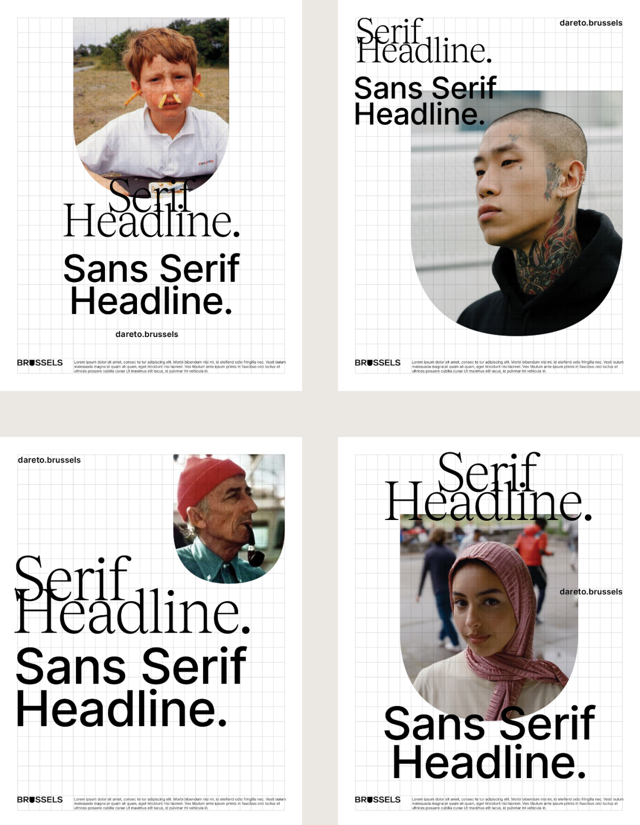
The Brussels collateral is based on a scalable grid system that maintains consistency throughout all brand materials, while allowing for flexibility of use. Brussels collateral follows a scalable system based on a 24 x 24 grid. This grid allows us to build out multiple columns as shown below. This grid can be used to determine the size and placement of visual elements.
Example
Headlines always align to the grid structure on the top.
The graphic shape always aligns to the grid structure on the top, left and right.
Additional elements, calls to action, copy, logos etc. all align to the grid structure.
Additional Examples
8. Animation
Our U animation can be used on digital marketing materials to house photography, illustration, art and patterns. By having the U as a 3D shape, the animation adds a surprising dimension to the identity.
Download Brussels Animations
Download
- Filename
- Brussels_Animations.zip
- Size
- 61 MB
- Format
- application/zip
Logo 1
In the animated version of the logo, imagery related to Brussels is revealed in the ‘U’ window while the rest of the word ‘Brussels’ remains static. Images can include photography, video, illustration, art, or patterns related to Brussels. Remember to use the animated logo sparingly and strategically to avoid distracting from the message or losing the viewer's attention. Each asset is shown in the U for two seconds.
Logo 2
The animation can further add surprise by incorporating the word Brussels into the animation. The image of the U will appear first followed by BSL, followed the rest of the word.
Brand Experience
It’s possible to play with a flexible and scalable grid that can be stacked up multiple times to create a unique and dynamic layout. This allows greater versatility and adaptability across various applications and media. When we stack the logo, we avoid perfectly aligning the logos vertically and do not use the same image in each U graphic.
Banner
For marketing use on digital sites and for more editorial purposes, the banner animation will follow the same rules as the text reveal animation.
Poster
The animation can be used on marketing materials to house videos and images. The poster allows for both a light and dark mode and will flip between colours at the same time the material inside the U changes. The poster permits a more editorial positioning, allowing text in Brussels Serif and Inter Medium both above and below the U.
9. Powerpoint
The powerpoint template has been designed to follow the Brussels brand look and feel. Please use the template provided and do not stray from the assigned typefaces and layouts.
Download Powerpoint Templates
Download
- Filename
- Brussels_Powerpoint_Template.zip
- Size
- 16 MB
- Format
- application/zip

If you have any questions about the new brand BRUSSELS feel free to contact: hello@internationalbrand.brussels
Home | Marketing Brussels | Brand Guidelines | Resources | Get Involved | News
© 2025 visit.brussels - Privacy policy - Cookies